Update III - A Complete Redesign
Hello, this time I don't want to write about myself too much. Just the website. I've spent almost 2 weeks now working on this big redesign, I really hope you like it!
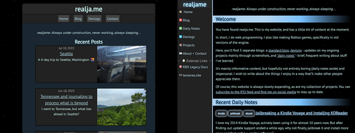
There's a sidebar instead of the old header. I think it's a more effective use of desktop screen space, and on mobile, it turns into a horizontally scrolling top bar! I was inspired by Zenith's website in terms of design. The influence is definitely noticable in a lot of places :)
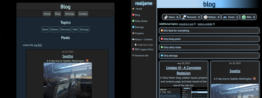
The blog page was redesigned too. I worked to add more comprehensive options for RSS and tags. Now, you can subscribe to individual feeds. And with tags, there's tags for more specific topics, which don't take up as much space as the commonly used tags.
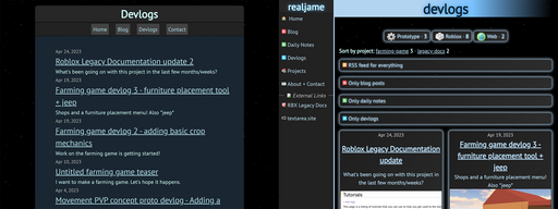
The Devlogs page finally looks like a normal blog index, so that's nice.
The Daily Notes post feed is brand new, and is home to short-form writing. It's inspired by Simon Willison's TILs. "TILs" (Today I Learned) will be the main type of post, but I hope to write more than that - personal thoughts, that kind of thing. We'll see. Despite the name, I don't think I will ever actually post daily. Every other day, if I'm lucky. I keep the name because it's kinda catchy and fits well regardless.
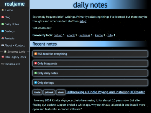
It already has 2 posts that you can go read:
- August 16, 2023: Installing the latest Ruby with rbenv on Debian
- August 18, 2023: Jailbreaking a Kindle Voyage and installing KOReader
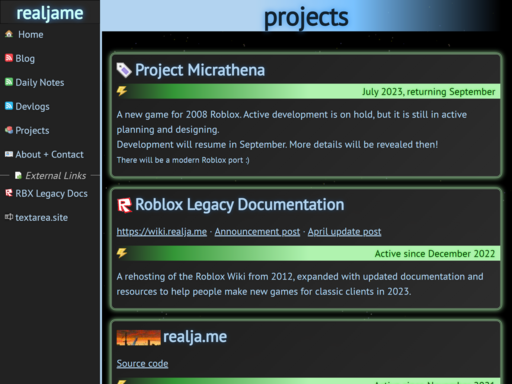
The Projects page is also new, listing my portfolio of works in a concise page. I spent a lot of time on its design, please give it a look!
The About + Contact page was remade from scratch, and it's very long now. It's not only about me, but it's about the site too. There are credits for the icons I used and shout-outs to people and sites that inspired mine! There's also a list of all my tech, if that's something you wanna see I guess.
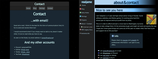
I'm also more open about my personal self, mainly on the about page. I put up my Resume, and linked to my LinkedIn page which shows my real face and name! Losing anonymity on the internet is something I've been thinking about, and generally, it's something I think I should do in order to help move towards profiting from my skills online. So there you go...
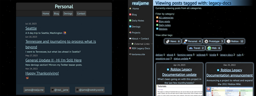
The tags system should be more robust and precise with the separate feeds. Tag filter pages now only show you posts from a certain feed, but give you the option to switch feeds or have all 3 feeds in the filter. This might be a bit overkill, but who's to say in a few years from now when this site has matured and there's, what, 100 posts? 200 notes?
Last thing: a new button, enjoy. You should see other websites using it update automatically, like Nick64's site :D

Speaking of which, I'm confident posting will be considerably more active. I've spent a lot of time thinking about what kind of content this website will have. The daily notes especially would allow me to write whatever I want without worry of disrupting more long-form, important posts. Plus, announcements won't get buried by other posts thanks to it being archived in the Projects page. Finally, realja.me is organized and capable for everything I want to do with it.

This is the 3rd time I made a status update after a few months of inactivity saying how I'm healthier and I'm back before being inactive again, but I dunno. This redesign has made me satisfied with the website. I don't feel uncomfortable looking at it, or guilty feeling that it's ugly, or neglected. I think every time I return in that way, I'm not entirely there, but I improve a little bit, and so does my site. This might be the one to push me over. 3rd time's the charm, right?
WE ARE SO BACK :))))))
